Last weekend, San Francisco developers converged at The Great Urban Hack to crank out some civically-minded sites. The focus was on the city's famous Tenderloin neighborhood. (Don't know it? Think Stonewall or The Maltese Falcon.)
The one that caught my eye was Tendermaps. It's an interactive map of the neighborhood, but it's not drawn by the city government or self-appointed journalists. No, it's a collage of boundaries and landmarks drawn— by hand, with Sharpies—by people who live and work in the area. Check it out.
To learn how it got online, I conducted an email interview with one of the developers, Zain Memon. Here's what he said.
How did you get the Sharpie drawings onto an online map? I see you wrote they were "scanned, and the handmade mark-ups extracted, georectified, and superimposed," but I'm hoping you can be specific (a.k.a geeky) about the process. How is each one of those steps accomplished?
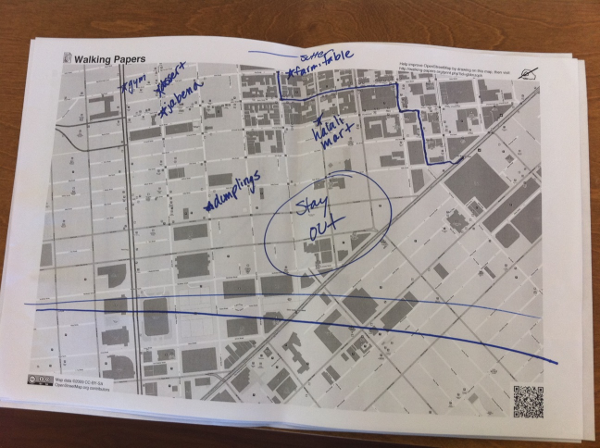
We used walking-papers.org to generate paper map prints of the tenderloin. We printed these out in grayscale and had people mark them up with colored sharpies. Here's a picture of one of them.
We scanned all of the maps into JPEGs and then used the Python Imaging Library to lift drawings off them. The coolest part was separating the drawings from the map itself — we basically checked each pixel's color, threw away the grayscale, and antialiased the rest. By reading the QR code in the bottom right corner, we gathered the bounding box of the map, and from there we could easily slice up the drawing into georectified tiles: one tile layer for each map.
Is any of the python code available online?
Not at the moment, no. But the walking-papers code is available at https://github.com/migurski/paperwalking (written by the venerable Mike Migurski of Stamen). We'll clean up our decoder and throw it on github at some point too.
If someone wanted to learn how to use PIL and other python tools to digitize printed data, how would you suggest they go about doing it?
I learned everything I know by playing with the tools available out there. It seems daunting at first, but once you start on a project, you suddenly find all these amazing libraries that make the impossible become possible and the difficult become easy. The PIL tutorial and handbook is a great place to start, as is the documentation for libraries like OpenCV, pycairo, and ImageMagick.
After you've collected a set of geospatial survey data, like you did here, what options do you have for aggregating it for analysis?
Correct me where I'm wrong, but it seems to me that tendermaps mainly tosses everything on the map and then allows users to filter it down using a set of browser knobs. I'm curious what other options there might be for mashing all the entries together and coming out with a finished product.
That's a great question. We chose to throw everything onto the map is because it really showed the order within the chaos of two dozen handwritten maps on the same screen.
It would've been really cool to have different views into the people behind the data too. For example, we heard a great suggestion asking for a map of the paths that young women take through the tenderloin, because those paths are presumably safer. It would be really interesting to see maps diving into those sorts of verticals.
Did you use GeoDjango for this project? If so, how? If not, why not?
Nope — the webserver backend is written with Flask. We georectified the tiles when saving them so we didn't need a geospatial database.
Who all worked on the project, what role did they play, and how much time did they put in?
I did all the back-end Python coding. Sha Hwang did all of the front-end (html/css/javascript). Jen Phillips and Alan Rorie went around the tenderloin and interviewed all the people who gave us maps. We were all at GAFFTA working on tendermaps from Saturday morning to late Sunday afternoon.
That's all I asked. If you have any more questions, drop them in the comments and maybe we can get Zain to answer them below.