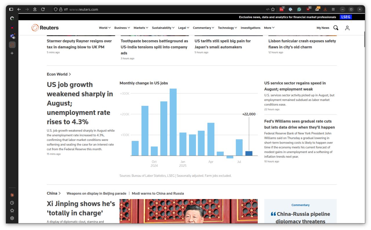
Here's a fun Reuters milestone.
Earlier this year, we established a prominent new showcase for our newsroom's data journalism by allowing interactive charts to embed on our homepage across all devices: the open web, Android and iOS.
I'm happy to report that the chart plotting this morning's U.S. jobs report marked the 100th time an automated graphic pushed out by our team's systems took advantage of the new tech and hit the front.
Like the other charts in our automated file - which includes real-time plots tracking markets, economics, public opinion and extreme weather - today's pop was prepared within seconds of the data release and with no labor required.
This aggressive approach to automating breaking news has resulted in our team leading the report three to four times per week on average. And it's freed up our talented reporters and editors to focus on more interesting and challenging work.
We're just getting started.