5. Styling the data
Data layers are styled using a powerful but complex configuration syntax known as the MapLibre Style Specification. It can be intimidating at first, but it gives you incredible control over how your data looks on the map.
Each storm track carries its attributes from the original dataset, and we can use them to control how features are drawn.
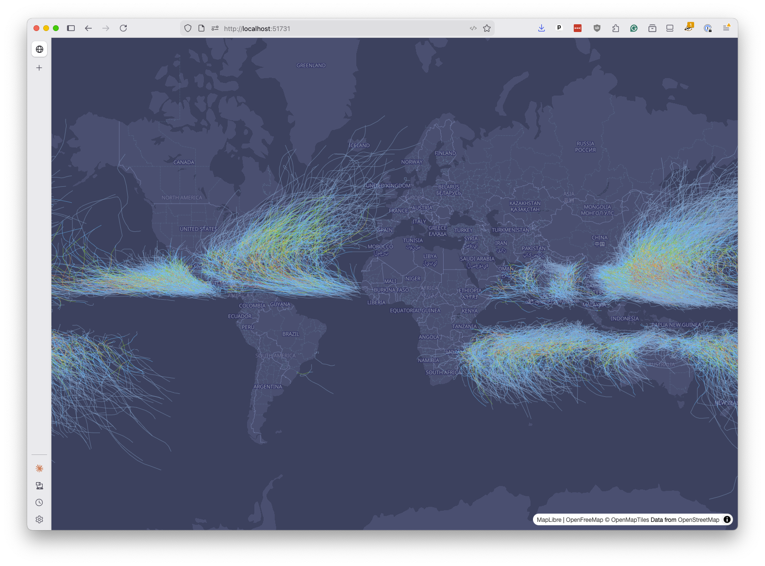
Let’s color the lines by the Saffir-Simpson Hurricane Scale category stored in the USA_SSHS field. By reading the NOAA documentation, we can see that the values in this field range from -5 to 5. Everything below -1 is a minor disturbance, while -1 represents tropical depressions, 0 represents tropical storms and 1-5 represent hurricane categories.
We can assign a color to each category using a MapLibre style configuration. We’ll do that by replacing the paint block with an interpolate expression:
map.addLayer({
  id: "storms-line",
  type: "line",
  source: "ibtracs",
  "source-layer": "storms",
  paint: {
    "line-color": [
      "interpolate",
      ["linear"],
      ["coalesce", ["get", "USA_SSHS"], -1],
      -1,
      "#7aa6c7",
      0,
      "#4dc9ff",
      1,
      "#8bc34a",
      2,
      "#ffd166",
      3,
      "#f4a261",
      4,
      "#e76f51",
      5,
      "#c71f37",
    ],
    "line-width": 1,
    "line-opacity": 0.5,
  },
});
Save and refresh. The storm tracks should now range from pale blue for tropical depressions to deep red for Category 5 hurricanes.
Let’s unpack that expression.
The "interpolate" directive produces a smooth, continuous output between stop values. That’s unlike the alternative of "step", which jumps between discrete values. The ["linear"] interpolation type instructs MapLibre to blend colors smoothly between the stops we define.
The ["coalesce", ["get", "USA_SSHS"], -1] option is telling the style which attribute to use for the interpolation. The ["get", "USA_SSHS"] part is a lookup that asks MapLibre to pull the value of the USA_SSHS property from each feature. The coalesce wrapper provides a fallback value of -1 if the property is missing.
The remaining pairs are input-output stops: when USA_SSHS is -1, or below, use #7aa6c7, when it’s 5 use #c71f37. Values between stops are smoothly blended.
Note
While the style specification is difficult for humans to read and write, it’s the kind of task that large language models like ChatGPT and Claude excel at.
You should learn enough of the syntax to understand how it works, but don’t hesitate to use a chatbot to generate or modify style configurations for you. You can then focus on verifying that the generated style does what you want, and tweaking it as needed.
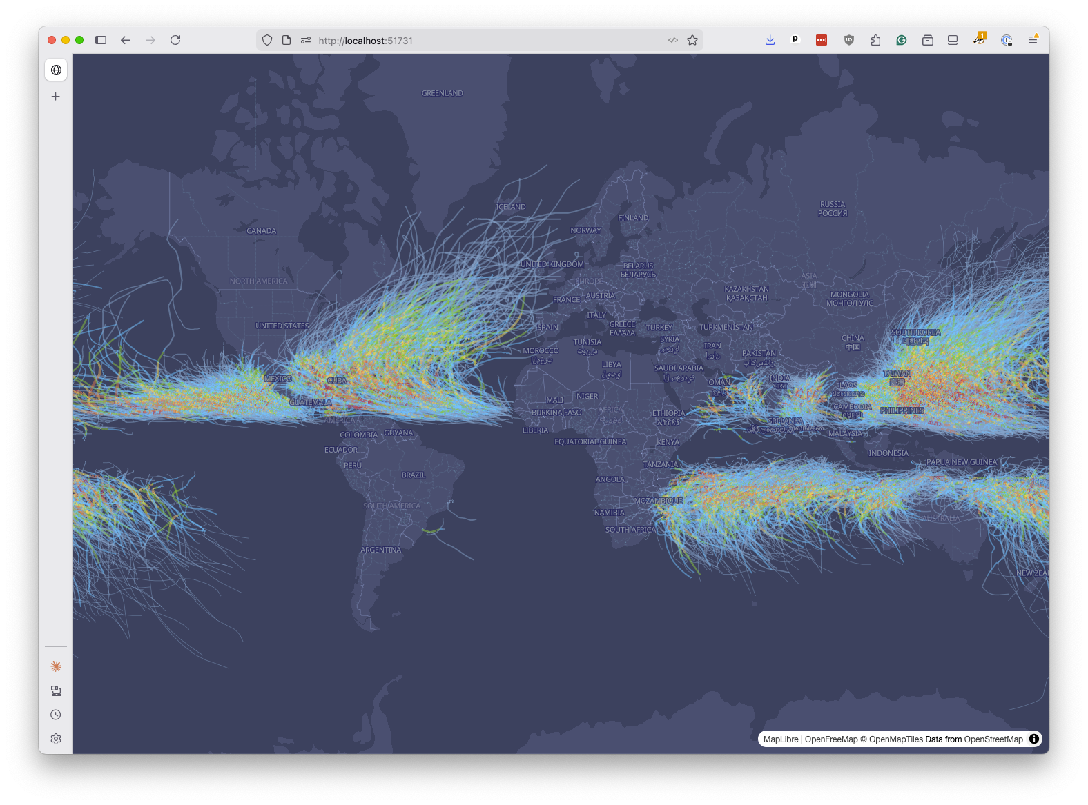
We can apply the same technique to line width using the USA_WIND field, which records the maximum sustained wind speed in knots. Replace the static "line-width": 1 with another interpolate expression that pairs wind speeds with widths:
map.addLayer({
  id: "storms-line",
  type: "line",
  source: "ibtracs",
  "source-layer": "storms",
  paint: {
    "line-color": [
      "interpolate",
      ["linear"],
      ["coalesce", ["get", "USA_SSHS"], -1],
      -1,
      "#7aa6c7",
      0,
      "#4dc9ff",
      1,
      "#8bc34a",
      2,
      "#ffd166",
      3,
      "#f4a261",
      4,
      "#e76f51",
      5,
      "#c71f37",
    ],
    "line-width": [
      "interpolate",
      ["linear"],
      ["coalesce", ["get", "USA_WIND"], 0],
      0,
      0.8,
      50,
      2,
      100,
      3.5,
      150,
      5,
    ],
    "line-opacity": 0.5,
  },
});
Save and refresh. The most powerful storms will now appear as thicker lines, while weaker ones stay thin.

You may have noticed that the storm tracks draw on top of the country labels from the basemap. This is a common issue with data layers.
We can fix it by telling MapLibre to insert our storms layer below the first label layer, which MapLibre basemaps typically refer to as “symbol” layers.
First you add a bit of code to find the ID of the first symbol layer. Then you pass that ID as the second argument to map.addLayer(), which tells MapLibre to insert the new layer just below it.
const firstSymbolLayerId = map
  .getStyle()
  .layers.find((layer) => layer.type === "symbol")?.id;

map.addLayer(
  {
    id: "storms-line",
    type: "line",
    source: "ibtracs",
    "source-layer": "storms",
    paint: {
      "line-color": [
        "interpolate",
        ["linear"],
        ["coalesce", ["get", "USA_SSHS"], -1],
        -1,
        "#7aa6c7",
        0,
        "#4dc9ff",
        1,
        "#8bc34a",
        2,
        "#ffd166",
        3,
        "#f4a261",
        4,
        "#e76f51",
        5,
        "#c71f37",
      ],
      "line-width": [
        "interpolate",
        ["linear"],
        ["coalesce", ["get", "USA_WIND"], 0],
        0,
        0.8,
        50,
        2,
        100,
        3.5,
        150,
        5,
      ],
      "line-opacity": 0.5,
    },
  },
  firstSymbolLayerId,
);
Save and refresh. The labels should now float above the storm tracks, making both easier to read.
As a finishing touch, let’s display the map as a 3D globe. MapLibre supports a globe projection that you can enable with the setProjection method after the map loads.
map.on("load", () => {
  map.setProjection({ type: "globe" });
  // ... rest of the code
});
Save and refresh. You should see your data displayed on an interactive globe that you can spin and zoom.
Congratulations. You’ve made your first PMTiles map. We won’t cover it in this class, but you can now host applications like this on any static hosting service, as long as the PMTiles file is accessible at the URL that accepts range requests.